Week 1 study notes
Design Judgment in the AI-Native Product Era
Explain design as evidence-based help for people using systems, read one everyday object and one product screen, compare vague and structured AI critique, curate AI output with accept/adapt/reject notes, and produce a small product decision artifact grounded in user, task, context, friction, and evidence.
Lesson focus
Design judgment is the discipline of making decisions that help people use systems well, especially when AI can generate options quickly. It starts with user, task, context, interface, friction, evidence, and decision. Product ownership begins when those observations become a clear choice about what to improve, defer, test, or explain.
Learning materials
Includes study notes, references, and practice examples.
Guided tutorial path
Work through the lesson by section. Each stop names the evidence to produce before the final readiness gate.
Lesson contents
How to use this lesson
Understand the lesson loop and what you need to produce.
This session is the entry point for the whole course. The visible topic is simple: what is design? The deeper purpose is more serious: learning how to observe a situation, name what matters, and turn that observation into a product decision.
Use seven words as your starting language: person, task, context, interface, friction, evidence, and decision. They are simple enough for day one, but serious enough to support product conversations later.
Work in a loop. First observe the object or screen. Then name what helps or blocks the user. Then ask AI or another person for another view. Finally, choose one improvement and explain why it matters.
- 01ObserveWhat is happening here?Look at the object or screen before naming the problem. The first move is evidence, not opinion.
- 02NameMake the observation discussable.Use a small shared vocabulary: user, task, interface, friction, feedback, evidence, decision.
- 03CompareDo not rely on one view.Ask AI or another person for another interpretation, then compare it with what you can see.
- 04DecideTurn noticing into product ownership.Choose one improvement and explain why it matters for the user task and product outcome.
Guided real-world reference
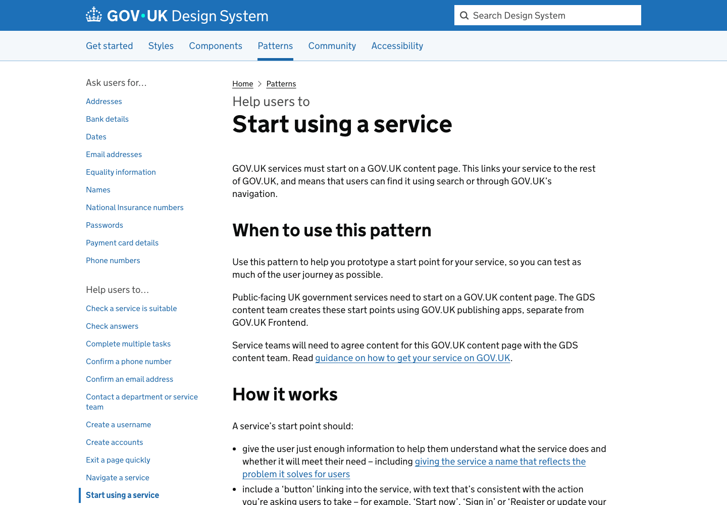
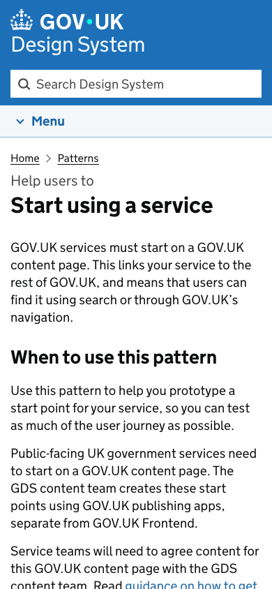
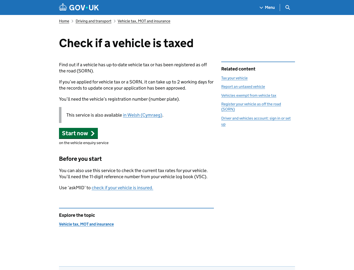
Practice evidence-based observation on the GOV.UK start-page pattern.
Start with a real product screen. A fictional example can explain a concept, but an official reference shows that professional design has standards, constraints, language, and context.
Use the GOV.UK Design System start-page pattern as your first guided observation. You do not need to know public-service design. You need to practice seeing what a page is for, who it helps, what evidence is visible, and how the same purpose behaves across desktop and mobile.
Complete this guided reference before choosing your own object or screen. It gives you a benchmark for what strong observation sounds like.
- 01ReadName the user and task.Use the desktop screenshot first. Write one sentence naming who the page is for and what they are trying to understand.
- 02PointGround every claim in evidence.Point to five visible details: GOV.UK identity and search, breadcrumb, page title, introductory paragraph, and guidance headings.
- 03CompareCheck the same purpose on mobile.Use the mobile screenshot second. Compare what changes, what remains visible, and whether the main purpose stays understandable.
- 04AskUse AI as a second reader.Only after the human notes are written, ask AI to check the observation and mark one point to accept, adapt, and reject.
- Write a human observation before using AI.
- Point to visible evidence instead of saying "clean" or "professional".
- Compare desktop and mobile without turning the task into a visual preference discussion.
- Save a board or screenshot with human notes, AI critique, accept/adapt/reject notes, and one final decision.
Buttons and action promises
Read the Start now action as a promise supported by visible evidence.
The second real-world reference introduces a smaller but essential idea: a button is a promise. Ask what the action will do, what information makes it safe to act, and what uncertainty might still slow the user down.
The GOV.UK vehicle-tax start page is useful because the action is visible, but it is not floating alone. It is supported by the page title, explanatory copy, prerequisite information, helper text, and a clear relationship between desktop and mobile.
This submodule gives you a practical habit that will return throughout the course: never critique a button only by color, size, or style. Read the action, the support around it, the risk before it, and the result after it.
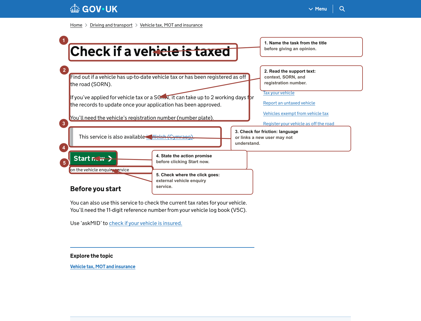
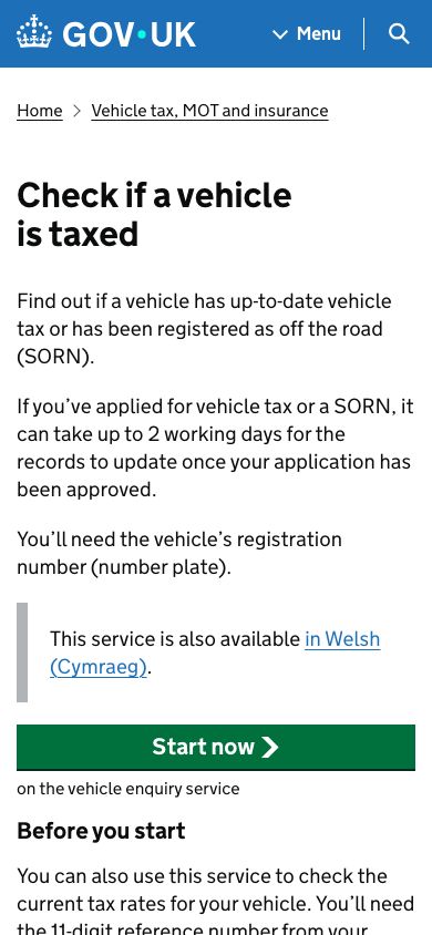
- 01LocateName the primary action.Find the main action and write the exact button label before judging whether the page is good.
- 02PromiseState what the action promises.Write: If I click Start now, I expect to begin checking whether a vehicle has up-to-date tax.
- 03SupportShow why the action is understandable.Point to the title, explanation, required registration number, and text under the button as support for the action.
- 04RiskFind one friction point.Name one hesitation, such as the external vehicle enquiry service, the required registration number, or whether you know what SORN means.
- You can explain what Start now promises without clicking it.
- You can name four visible support details around the action.
- You can identify one risk or hesitation before the click.
- You can compare desktop and mobile action presentation without reducing the critique to visual preference.
Trust before commitment
Inspect consequence, scope, requirements, and confidence before action.
The third real-world reference teaches that trust is not a visual mood. Trust is built from information that lets the user decide whether it is safe, correct, and worthwhile to continue.
The Dart Charge page is useful because it asks the user to move toward payment, account setup, or fine handling. Before the button, the page exposes consequence, scope, required information, and an existing-account route.
This submodule gives you a sharper lens for checkout and payment patterns later. Stripe and Shopify can be used as official link-first references, but the screenshot anchor here stays rights-safe through GOV.UK.
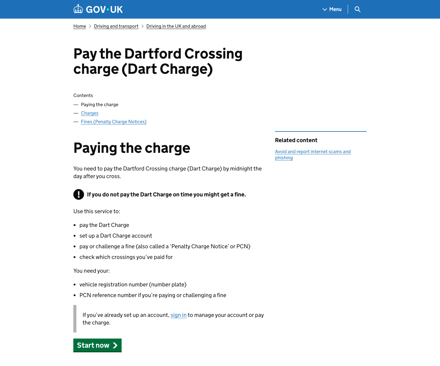
- 01CommitmentName what is at stake.Write what the user may be committing to: paying a charge, setting up an account, handling a fine, or checking paid crossings.
- 02EvidenceFind six trust supports.Point to the deadline, fine warning, service scope, required information, sign-in path, and Start now action.
- 03BalanceSeparate confidence from pressure.Write one confidence note and one pressure note. The page can be helpful and anxiety-producing at the same time.
- 04MobileCheck what appears before the button.Compare the mobile first view. It shows consequence and scope before the action, which can be appropriate when commitment risk is high.
- You can name the commitment before judging the page.
- You can point to six visible trust evidence details.
- You can distinguish confidence support from pressure or anxiety.
- You can explain why the mobile first screen may show consequence before action.
First AI critique setup
Open a clean AI critique chat and save prompt evidence.
The first AI interaction is part of the learning method, not a side activity. You are learning how to give AI enough context to be useful while keeping human observation in charge.
Start from a real tool entry point, then create a clean chat and paste the structured prompt. The first output is not the answer. It is material to inspect, accept, adapt, reject, and cite in your final decision.
The privacy rule is simple: use public pages, safe objects, redacted screens, or written descriptions. Do not paste private personal data, customer data, passwords, payment details, medical information, or anything you would not want reviewed by another person or partner assessor.
- 01ClickOpen the AI tool entry screen.Open chatgpt.com or the AI assistant available to you. Use a course-provided sign-in if one exists; otherwise use a personal account you control. If sign-in is blocked, use another safe AI assistant and save the prompt and output.
- 02ClickStart with a clean chat.Start a new chat or clean conversation. Do not reuse an old chat because older context can change the answer and make the evidence trail unclear.
- 03TypeUse the exact first prompt.Paste the structured Lesson 1 prompt. Replace the bracketed parts with the real object, GOV.UK screen, or safe product screen you are studying.
- 04CheckInspect the prompt before running it.Before sending, check that the prompt names the object or screen, user, task, context, output fields, recommendation limit, and uncertainty requirement.
- 05ReadFind the useful evidence.Read the answer for visible evidence. Highlight claims that point to title, button label, helper text, layout order, trust information, friction, or missing context.
- 06RejectDo not copy generic critique.Reject or mark any sentence that sounds polished but does not point to the object, screen, user task, or visible evidence.
- 07SaveCapture the evidence trail.Save the prompt, the response, one accepted point, one adapted point, one rejected point, and the final decision sentence in your prompt log or board.
- You can show the clean chat or prompt log used for Lesson 1.
- Your prompt includes user, task, context, evidence, output fields, recommendation limit, and uncertainty.
- Your saved response separates accepted, adapted, and rejected AI points.
- No private, financial, medical, identity, customer, or account data appears in the prompt or screenshot.
First FigJam/Figma board setup
Create the first evidence board with separate human and AI zones.
The first visual workspace is not assumed. You need to see where the tool begins, what file type to choose, what to name the board, what zones to create, and what evidence to save.
FigJam is useful here because it is an online whiteboard. The goal is to organize observation, AI critique, curation, and a final decision. You are not expected to create polished UI design in this first lesson.
The board is the first reviewable artifact. It should let a peer, reviewer, or future partner assessor see the path from human observation to AI critique to human decision without needing you to explain everything live.
- 01ClickOpen the FigJam creation path.Type figjam.new in the browser address bar, or open Figma and choose a new FigJam board from the file browser.
- 02Sign inPass the account gate safely.If Figma asks you to sign in, use a course-provided account if one exists; otherwise use a personal account you control. If account creation is blocked, sketch the same board zones in a document and save a screenshot or link.
- 03ChooseSelect the right file type.Create a blank FigJam board rather than a Figma Design file. Lesson 1 needs a simple evidence board, not a polished UI canvas.
- 04TypeName the artifact clearly.Rename the board Lesson 1 Design Observation. Add the date and your initials if your course setup uses initials.
- 05TypeAdd the board zones.Create six visible zones: Human observation, Vague AI output, Structured AI output, Accept/adapt/reject, Final decision, and Reflection.
- 06AddPlace evidence before AI.Add the GOV.UK screenshot or your safe screen first, then add human notes before adding any AI output. This protects your own observation.
- 07PasteCurate the AI output.Paste only short AI excerpts. Mark one point to accept, one to adapt, and one to reject, then write the final decision sentence.
- 08SaveKeep reviewable evidence.Save the board link or screenshot, the AI prompt, the AI response, the accept/adapt/reject notes, and the final decision sentence.
- The board has a clear Lesson 1 title.
- The board includes the real reference screenshot or a safe redacted screen.
- Human observation appears before AI output.
- AI output is shortened, curated, and labeled accept/adapt/reject.
- The final decision sentence is visible without opening another file.
- The saved screenshot or board link is understandable to someone reviewing it later.
Product + Design + AI operating model
Connect product, design, and AI into the repeatable course loop.
This course is Product + Design + AI. Product is the field where the work matters. Design is the specialist capability that helps you see quality and shape user experience. AI is the accelerator that makes options, drafts, critique, and prototypes appear faster.
This first lesson is AI-native, but not AI-dependent. Use AI to think faster while also learning that generated output is not automatically good output. Your job is to give direction, inspect evidence, reject weak assumptions, and make the product decision.
The tool bench starts deliberately small but fully guided. Use one LLM and one visual workspace, then follow the first click, the first typed prompt, the first board labels, the first quality check, and the first saved screenshot or link. Beginner confidence comes from seeing the exact path before being asked to perform.

- Sub-module A: AI critique setup. Open one AI chat, paste the structured prompt, and copy the parts that name user, task, friction, evidence, uncertainty, and recommended decision.
- Sub-module B: FigJam or Figma board setup. Create one blank board, type the exact zone labels, and place human observation apart from AI output.
- Sub-module C: Evidence save. Export or screenshot the board, save the prompt and response, and write the final decision sentence in your artifact folder.
- Later AI production tools such as Figma Make, Google Stitch, v0, Lovable, Bolt.new, Uizard, Adobe Firefly, and Canva Magic Studio come later, only when they serve a specific product/design task.
- You can point to the exact text you typed and explain why the prompt is structured that way.
- The board shows human observation before AI output, so you do not outsource noticing.
- The saved screenshot or link contains enough evidence for a reviewer to understand the learning process.
- The final decision sentence names a user, task, friction, evidence, product reason, and tradeoff.
What design means professionally
Define design as professional evidence-based help, not decoration.
In everyday conversation, people often use "design" to mean appearance. In professional product work, design means more than appearance. It is the shaping of a product, service, object, or system so people can understand it, use it, and reach an outcome.
Human-centred design gives this lesson its academic foundation. ISO 9241-210 frames human-centred design around interactive systems across their life cycle. NIST summarizes the goal in practical terms: systems should be usable and useful by focusing on users, needs, requirements, human factors, usability, accessibility, and evaluation.
You do not need to read standards documents in Week 1. For now, use this simple definition with serious backing: design is the practice of making decisions that help people use systems well.
- Design is concerned with people and systems interacting, not only with visual surface.
- A useful design helps the right person complete a meaningful task in a real context.
- A usable design reduces avoidable confusion, effort, risk, and delay.
- A responsible design considers accessibility and evaluation before and after launch.
Decoration, usability, and product value
Separate style, usability, accessibility, and product value.
Decoration can matter. Color, imagery, mood, typography, brand personality, and visual polish all influence how a product feels. The mistake is treating decoration as the whole of design.
A button can be beautiful and still unclear. A form can be stylish and still too difficult. A screen can look modern while hiding the most important information. Good design asks whether the person can complete the task with confidence.
For a product owner, this distinction is vital. If the problem is decoration, the next decision might be about brand expression. If the problem is usability, the next decision might be about labels, sequence, information hierarchy, accessibility, or error prevention.
First vocabulary set
Learn the first vocabulary for user, task, context, interface, friction, evidence, and decision.
You do not need a large vocabulary in Session 1. You need a small vocabulary that can be used immediately. These six words make design talk more precise without turning the lesson into jargon.
The most important move is from opinion to evidence. "This is confusing" is a start. "This may be unclear because the page mentions an external service and SORN before the user starts" is a stronger design statement.
User
The person using the object, screen, service, or system.
Example: In a food delivery app, the user may be a hungry person ordering dinner.
Task
The action the user is trying to complete.
Example: Choosing a restaurant, paying for an order, booking a time, or sending a message.
Interface
The part of a product or object the user sees, reads, touches, clicks, hears, or controls.
Example: A screen, button, form, menu, handle, switch, label, sound, or warning.
Friction
Anything that makes progress harder, slower, less clear, less safe, or less trustworthy.
Example: A hidden fee, unclear button, tiny label, missing confirmation, or confusing error.
Feedback
A signal that tells the user what happened, what state they are in, or what to do next.
Example: A loading spinner, success message, disabled button, error text, light, sound, or vibration.
Evidence
A visible detail or observed behavior that supports a design judgment.
Example: The page says the user needs a registration number before Start now, so the action has useful support.
How to read an everyday object
Read an everyday object through user, task, helpful decisions, and friction.
Everyday objects are excellent practice material because they make design physical. A kettle, door handle, microwave, medicine bottle, traffic sign, remote control, or washing machine already contains decisions about shape, labels, order, feedback, and safety.
The point is not to find a perfect object. The point is to slow down and see how the object teaches the user. A handle suggests where to hold. A switch suggests what changes. A light gives feedback. A label explains a state. A badly placed label or tiny measurement line creates friction.
This exercise protects confidence. You do not need drawing skill or software knowledge to begin. You only need to look carefully and explain what the object is doing for the person.

- What is the object helping a person do?
- Which part invites the correct action?
- Which part shows state, safety, quantity, direction, or consequence?
- What could the user misunderstand if they were tired, rushed, distracted, or new?
- What one change would improve the task without redesigning everything?
How to read a product screen
Read a product screen through task, interface evidence, and friction.
A product screen is also an interface. It teaches the user what matters, what can be done, and what happens next. A screen can fail even if it looks polished, because polish does not guarantee clarity.
Professional screen reading starts with purpose. What is the user trying to do at this moment? Then it looks for the primary action, information order, language, feedback, and accessibility. These areas connect directly to sources such as Apple interface guidance, USWDS accessibility guidance, and Nielsen Norman Group usability heuristics.
For Session 1, analyze only one screen at a time. Complexity will come later. A single public service start page, calendar event screen, food ordering screen, map screen, or checkout screen is enough.
- Purpose: what moment is this screen for?
- Primary action: what should the user do next?
- Information order: what must be understood first, second, and third?
- Language: are labels and messages familiar and specific?
- Feedback: does the screen show status, success, error, loading, or next step?
- Accessibility: can different users perceive, operate, and understand the interface?
From observation to product ownership
Turn observation into one scoped product decision.
Product ownership begins when design observation becomes a decision. A product owner does not only collect opinions. They help the team understand what matters, why it matters, and what should happen next.
This is why the artifact for Session 1 is a design observation and product decision sheet. You practice moving from "I noticed this" to "I would improve this first because it affects this user task."
This is also where startup relevance appears. In a fast startup, the team rarely has complete certainty. The product owner must make limited but thoughtful decisions: improve this, defer that, test this assumption, clarify this acceptance criterion, or ask for more evidence.
- 01ObservationThe page asks the user to begin a vehicle-tax check.Describe what you can see without solving it yet.
- 02EvidenceThe screen shows the task, registration-number requirement, and Start now action.Point to the exact screen area, label, sequence, message, or behavior.
- 03JudgmentUnfamiliar terms or handoffs can reduce confidence before the user starts.Explain why the evidence matters to the user and business.
- 04DecisionTest a short clarification while keeping the main layout stable.Choose a practical next step that a team could build, test, or defer.
AI as a study partner
Compare vague and structured AI critique, then curate the output.
AI appears in this lesson as a study partner, not as a replacement designer. It can explain vocabulary, offer alternative readings, generate examples, and help you write clearer decisions. This is especially useful when you are new to design language or learning in a second language.
AI also creates risk. Figma's own AI guidance warns that AI outputs may be misleading or wrong and should not replace expert advice or research. NIST's AI risk work similarly reminds teams that trustworthiness must be managed. For this lesson, the simple rule is: AI can help you think, but you still check.
Good prompting is not a magic phrase. OpenAI's prompting guidance emphasizes clear instructions, audience, purpose, and iteration. For product design, that means providing context, naming the user and task, asking for evidence, and requiring uncertainty.

I am studying beginner product design.

Object or screen I am looking at:
[describe it here]

Please help me analyze it in simple English.
Return:
1. User: who is this for?
2. Task: what is the person trying to do?
3. Context: where or when might they use it?
4. Helpful decisions: what makes the task easier?
5. Friction: what could confuse, slow, or worry the user?
6. Evidence: what can I point to in the object or screen?
7. Product decision: one improvement I would choose first, and why it matters.

Rules:
- Do not redesign the whole thing.
- Give two possible improvements, then recommend one.
- Tell me what you are uncertain about.
- Use plain language suitable for a new learner.
- Does the answer refer to visible evidence from the object or screen?
- Does it name the user and task, not only the visual style?
- Does it recommend one realistic improvement instead of redesigning everything?
- Does it admit uncertainty where context is missing?
- The answer says "modern", "clean", or "intuitive" without proof.
- The answer invents user research or business facts we did not provide.
- The recommendation is too broad for a first improvement.
- The AI ignores accessibility, context, or the real task.
I am practicing product/design judgment.

Observation:
[paste my observation]

Give me:
1. Three possible interpretations of what is happening.
2. The visible evidence that would support each interpretation.
3. One thing I may be assuming without enough evidence.
4. One question I should ask before recommending a change.
- Does AI challenge your assumptions instead of only improving your wording?
- Does it separate evidence from interpretation?
- Does it name what would need user research or more context?
- AI treats every interpretation as equally likely.
- AI invents user behavior that is not visible.
- AI gives a confident answer without naming missing evidence.
Act as a product design tutor.

My draft decision sentence:
[paste sentence]

Improve it so it is clear enough for a product team.
Keep it to one sentence.
It must include:
- what I would improve first
- the user task it affects
- the product reason it matters
- one tradeoff or reason I am not redesigning everything
- Does the sentence name the change, user task, product reason, and tradeoff?
- Can a designer, engineer, or founder understand the next move?
- Is it one decision rather than a pile of unrelated suggestions?
- The sentence becomes generic product language.
- The recommendation is too large for one first improvement.
- The tradeoff disappears.
Turn this observation into a simple FigJam board structure.

Observation:
[paste observation]

Return:
1. Board title.
2. Five sticky-note headings.
3. The exact text for each sticky note.
4. One "accept/adapt/reject" section for AI feedback.
5. One final product decision sentence.

Keep the board simple enough for a beginner to recreate in 10 minutes.
- Can you recreate the board in 10 minutes?
- Does the board separate human observation from AI critique?
- Does the final note preserve your product decision?
- The board becomes a complex design workshop template.
- AI creates too many sections for Session 1.
- The tool output hides the original evidence.
Critique an AI-generated interface
Critique the controlled AI-generated sample without accepting polish as proof.
The course is AI-native from the first lesson, so do not only ask AI for critique. Also learn to critique AI-generated interface output. A generated screen can feel impressive because it has layout, color, cards, buttons, and confident language. That surface polish can hide weak product thinking.
This controlled sample is intentionally not a real product and not a recommendation. It is a safe practice surface. Inspect it with the same words used throughout Lesson 1: person, task, context, interface, friction, evidence, and decision.
The lesson is not full prompt-to-interface production yet. It builds the judgment habit that makes later AI production useful: label generated material, observe it carefully, challenge unsupported claims, accept/adapt/reject the output, and choose one scoped improvement.
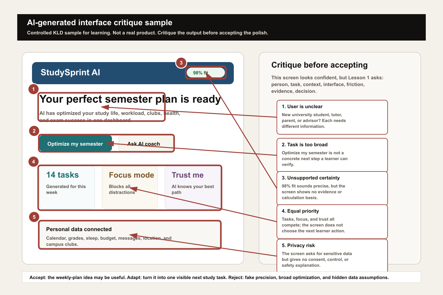
- 01LabelName the artifact status.Write "controlled generated sample" or "AI-generated draft" at the top of the board so reviewers do not confuse it with a real product screen.
- 02ObserveSeparate visible evidence from interpretation.Describe what is visible before judging it: title, buttons, cards, scores, data claims, and any privacy-sensitive information.
- 03QuestionLook for user, task, context, and evidence gaps.Ask who the screen is for, what task it supports, where the person is in the journey, and what proof is missing.
- 04CurateAccept, adapt, and reject.Keep useful structure, adapt vague ideas into one small action, and reject fake precision, broad promises, or hidden data assumptions.
- 05DecideEnd with a scoped product/design move.Write one decision a real team could discuss, such as "turn the broad planner into one next study task and explain what data is required before connecting accounts."
- The artifact is clearly labeled as generated or controlled sample.
- The critique names at least one user/task gap and one evidence gap.
- You reject fake certainty instead of copying it into the final decision.
- You name one useful idea to adapt, not a full redesign.
- The final decision mentions a tradeoff or unanswered question.
Model artifact and quality examples
Use the GOV.UK model artifact to see the quality standard.
A strong answer does not need advanced vocabulary. It needs specificity. It names the user, task, helpful decision, friction, evidence, AI curation, first improvement, and tradeoff.
The model artifact uses a real GOV.UK service screen to make the quality bar visible. The weak answer is not weak because it is short. It is weak because it cannot support action. The better answer starts to use evidence. The strong answer shows enough reasoning for a product team or external reviewer to understand the decision.
Use the model artifact as the reusable benchmark: the source screen, human notes, AI contrast, curation, decision, and tradeoff should all remain visible to a reviewer.

Human observation
- User
- Someone checking whether a vehicle has up-to-date tax.
- Task
- Start a vehicle-tax status check before entering the registration number.
- Context
- A public-service start page, likely used before the person knows exactly what information the service will ask for.
- Helps
- The page title, short explanation, registration-number requirement, and Start now button make the task understandable.
- Friction
- The page sends the person to an external vehicle enquiry service and uses the term SORN, which may be unfamiliar.
- Evidence
- The screen says "Check if a vehicle is taxed", "You will need the vehicle's registration number", "This page is also available in Welsh", "Start now", and mentions SORN in the helper text.
- Assumption
- A new user may not know SORN or may wonder what happens after the external service opens.
Vague AI output
- Prompt
- Is this design good? It is a GOV.UK page with a Start now button.
- Likely output
- The page is simple, clear, professional, and easy to use. The green button stands out, and the layout looks trustworthy.
- Why weak
- It praises GOV.UK style but does not inspect the task, action promise, support text, external-service handoff, or user uncertainty.
Structured AI output
- Useful evidence
- AI names the start-page task, the registration-number requirement, the visible Start now action, and the SORN or external-service uncertainty.
- Recommendation
- Keep Start now, but consider clarifying the external-service handoff or unfamiliar terms if users hesitate.
- Uncertainty
- AI cannot know actual user familiarity with SORN, completion analytics, or support requests from this screenshot alone.
Accept, adapt, reject
- Accept
- A button is a promise: Start now should lead into checking a vehicle tax status.
- Adapt
- Turn "add more explanation" into a scoped decision: clarify only the unfamiliar handoff or term if evidence shows hesitation.
- Reject
- Do not redesign the GOV.UK page, change the button style, or add decorative elements based on taste.
Final product/design decision
- Decision
- I would keep the Start now action and test a short clarification for unfamiliar terms or the external-service handoff, because the user needs confidence before beginning the vehicle-tax check; I would leave the layout unchanged because the main action and required information are already clear.
- Tradeoff
- More explanation can reduce uncertainty, but too much text can slow down a simple start page.
Weak
This GOV.UK page looks clean and official. AI said it is clear, so I would make the Start now button bigger and add an icon.
Evidence: The answer uses words such as clean, official, and bigger without pointing to what the user is trying to do or what the screen shows.
Assessment: This is not yet assessment-ready because it treats AI as the authority, stays at the level of taste, and gives no user task, visible evidence, scope, or tradeoff.
Better
This page helps someone check whether a vehicle is taxed. The Start now button is clear and the page says a registration number is needed. I would explain SORN because some users may not know it.
Evidence: The answer points to the Start now action, the registration-number requirement, and the SORN term, so it is moving from taste toward user-task reasoning.
Assessment: This is useful but not fully strong. It names the task and one friction point, but it does not preserve the AI trail, state uncertainty, or explain why this change should be chosen instead of a broader redesign.
Strong
A person checking vehicle tax needs to know what will happen before starting. The screen clearly states the task, required registration number, and Start now action, but the text mentions an external service and SORN, which may create hesitation. I would keep the main layout and test a short clarification for SORN or the external handoff, because the highest-risk issue is confidence before starting, not visual polish.
Evidence: The answer names user, task, visible evidence, friction, condition, decision, and tradeoff without inventing research or metrics.
Assessment: This is strong for Lesson 1 because a product team could discuss, test, or scope the decision immediately. It also keeps AI in a supporting role instead of letting AI own the judgment.
- 01Human observationA vehicle owner may need confidence before Start now.First name the user, task, context, helpful decisions, friction, visible evidence, and assumption before asking AI for help.
- 02Vague promptThe prompt gives AI too little context.Save the weak prompt as a contrast exercise: "Is this design good?"
- 03Vague outputThe output sounds polished but is not decision-grade.The likely answer praises official style, button visibility, and simplicity, but misses priority because the prompt did not name user, task, evidence, or criteria.
- 04Structured promptThe prompt becomes a tiny product/design brief.Then provide the screen description, user task, output fields, recommendation limit, and uncertainty requirement.
- 05Stronger outputAI becomes useful because the criteria are clearer.The stronger answer identifies the Start now promise, the registration-number prerequisite, the external-service handoff, and uncertainty about SORN familiarity.
- 06Accept/adapt/rejectCurate the AI output.Accept the action-promise reading, adapt the clarification into a testable small change, and reject decorative polish or full redesign advice.
- 07Revised decisionHuman judgment owns the final product move.Keep Start now and test a short clarification for unfamiliar terms or the external-service handoff, while keeping the layout stable.
Studio exercise and rubric
Complete the studio exercise and compare the artifact against the rubric.
Use the studio exercise as practice, not as a quiz. Work through the first example using the model, then attempt a second example independently. If you get stuck, ask questions that return to evidence instead of rushing into redesign.
The target artifact is small but serious: one object observation, one screen observation, one AI-output critique, one prompt comparison, one FigJam or Figma observation board, accept/adapt/reject notes, and one product decision sentence. Small does not mean shallow. This artifact trains the exact habits used later in briefs, critique sheets, acceptance criteria, prototypes, and case-study writing.
Use the public handout to complete the artifact without guessing what strong looks like. Return to the model artifact whenever you drift into taste, copying AI, or redesigning too broadly.
- 01Part AEveryday object readingChoose one physical object and complete the observation fields.
- 02Part BProduct screen readingChoose one safe, non-private app or web screen and complete the same fields.
- 03Part CAI-generated output critiqueGenerate or paste one simple AI design critique or interface idea, then identify what is specific, what is vague, and what is unsupported.
- 04Part DPrompt comparisonRun the vague prompt and the structured prompt. Mark one AI point to accept, one to adapt, and one to reject.
- 05Part EProduct decisionOpen FigJam or Figma if available, or use a simple document board. Make the observation zones visible and write one decision sentence: I would improve ___ first because ___.
- Names a plausible user and task.
- Uses visible evidence instead of taste alone.
- Identifies at least one helpful design decision.
- Identifies one friction point without exaggerating.
- Uses AI critically: accept, adapt, or reject.
- Compares vague AI output with structured AI output.
- Keeps human observation separate from AI output.
- Explains at least one accepted, adapted, and rejected AI suggestion.
- Creates or sketches a simple visual observation board.
- Finishes with one clear product decision sentence that names a tradeoff or uncertainty.
Lesson 1 readiness gate
Check whether the artifact is reviewable before moving to Lesson 2.
Do not treat Lesson 1 as complete just because a page was read, AI produced a response, or a board exists. The standard is a reviewable reasoning trail.
Before moving to Lesson 2, your artifact should let another person understand what you observed, what AI added, what you accepted, adapted, or rejected, and why one decision is the next best move.
This gate is deliberately strict. It protects the course standard: design is not a list of tips, AI is not the final judge, and a product/design decision should be grounded in person, task, context, interface, friction, evidence, and tradeoff.
- I completed the required GOV.UK real-reference warm-ups before choosing my own example.
- I created or saved one board or screenshot with human observation before AI output.
- I saved the exact prompt and AI response.
- I marked one accepted AI point, one adapted AI point, and one rejected AI point with reasons.
- I wrote one final decision sentence that names user task, visible evidence, tradeoff, and uncertainty.
- I used no private, sensitive, customer, financial, medical, or identity data.
- Another reviewer can understand the artifact without me explaining it live.
Home study and follow-up reading
Use optional references and home study prompts after the required path.
For home study, find three designed things: at least one everyday object, one app or web screen, and one service or sign. For each, answer: who is the user, what task are they trying to complete, what helps, what creates friction, what evidence supports the observation, and what would I improve first?
The readings below are optional professional references. You do not need to read all of them after Session 1. They are included so the lesson remains grounded in real professional sources while keeping the main study path accessible.
Optional professional references
Resources and submission
Keep the review materials close, but separate from the main path.
Use these blocks when preparing the final artifact or checking optional references after the guided tutorial.
Artifact, self-check, and base prompt
Complete a three-loop studio exercise: read one everyday object, read one safe app or web screen, critique one AI-generated design suggestion, compare a vague prompt with a structured prompt, then follow the click/type/check/save tool lab to capture the result in a Figma/FigJam observation board before writing one product decision sentence.
- Can the learner separate decoration from design without dismissing visual quality?
- Can the learner name a plausible user, task, context, interface, friction point, and evidence?
- Can the learner explain one helpful design decision in an everyday object?
- Can the learner read a product screen by purpose, information order, primary action, feedback, and accessibility?
- Can the learner use AI for explanation or critique while identifying what to accept, adapt, and reject?
- Can the learner compare vague AI output with structured AI output and explain why one is more useful?
- Can the learner explain why a weak, better, and strong answer differ in evidence quality?
- Can the learner follow the guided ChatGPT and FigJam/Figma click/type/check/save sequence without guessing the first step?
- Can the learner create a simple visual observation board in Figma or FigJam and save a screenshot or link as evidence?
- Can the learner finish with one product decision sentence that a team could act on?
I am studying beginner product design.

Object or screen I am looking at:
[describe it here]

Please help me analyze it in simple English.
Return:
1. User: who is this for?
2. Task: what is the person trying to do?
3. Context: where or when might they use it?
4. Helpful decisions: what makes the task easier?
5. Friction: what could confuse, slow, or worry the user?
6. Evidence: what can I point to in the object or screen?
7. Product decision: one improvement I would choose first, and why it matters.

Rules:
- Do not redesign the whole thing.
- Give two possible improvements, then recommend one.
- Tell me what you are uncertain about.
- Use plain language suitable for a new learner.
References and web examples
References
The current ISO standard for human-centred design of interactive systems. Use it to anchor the lesson in professional practice: design work continues across the product life cycle and is concerned with human-system interaction.
NIST Human Centered DesignNIST summarizes human-centered design as making systems usable and useful by focusing on users, needs, requirements, human factors, usability, accessibility, and evaluation.
Design Council Double DiamondA visual model for moving from understanding a problem to testing possible solutions. It helps the learner see design as inquiry and decision-making, not decoration.
Nielsen Norman Group: 10 usability heuristicsJakob Nielsen's enduring interaction-design heuristics. Session 1 uses only a beginner subset: visibility, familiar language, recognition over memory, focus, and error recovery.
Apple UI Design Dos and DontsPractical interface guidance for layout, hit targets, readable text, contrast, organization, and alignment. Useful for translating design ideas into visible interface checks.
U.S. Web Design System accessibility guidanceA clear accessibility reference for perceivable, operable, understandable, and robust interfaces, plus concrete reminders that accessibility requires testing and iteration.
Figma AI tools in Figma DesignCurrent Figma guidance for AI design tools, including the reminder that AI output can be misleading or wrong and should be checked against research and expert judgment.
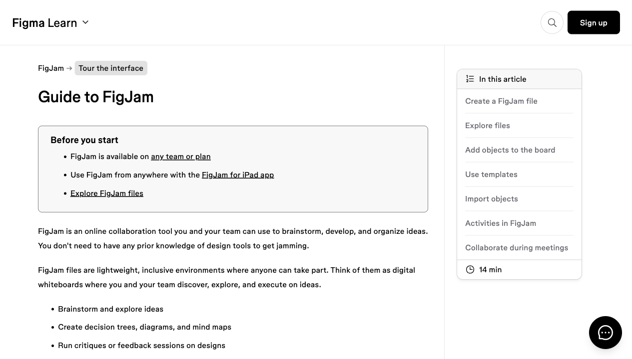
Figma Learn: Guide to FigJamOfficial FigJam guidance for creating a FigJam file and using the board as a lightweight collaborative space for sticky notes, diagrams, critiques, and research organization.
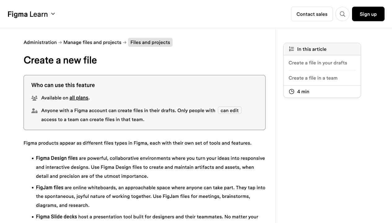
Figma Learn: Create a new fileOfficial Figma guidance for creating new Figma Design and FigJam files, including the simple figma.new and figjam.new entry points.
OpenAI Academy: Prompting fundamentalsOpenAI Academy guidance on writing clear prompts, setting the task and audience, asking for options, and iterating toward more useful responses.
Figma MakeFigma Make is a current signal that product/design learners need prompt-to-prototype judgment, not only static screen awareness.
Google Labs: Stitch AI UI DesignGoogle Stitch is an AI-native UI design canvas that shows where prompt-to-interface workflows are heading.
v0 documentationv0 shows how prompts can become product interface prototypes and code, which raises the value of clear product/design direction.
Lovable quick startLovable is a practical example of natural-language full-stack product building, useful later when design judgment moves into prototype critique.
Bolt.newBolt.new connects prompting with an in-browser development environment, reinforcing that AI acceleration still needs human product criteria.
IBM Enterprise Design ThinkingIBM's design-thinking approach is useful for connecting beginner observation to user outcomes, rapid making, reflection, and alignment across a team.
Web examples
Use this as the first professional contrast: Apple frames good interface work through readable content, touch targets, contrast, spacing, organization, and alignment. That lets the learner see design as concrete decisions, not taste.
GOV.UK Design SystemButton component and start buttonsThe GOV.UK start button is a simple, teachable example of a main action. It shows how one visible action can reduce uncertainty at the beginning of a service journey.
Baymard InstituteCart and checkout usability researchBaymard's checkout research gives the product-owner bridge: small design friction in checkout can become lost revenue, support load, and user abandonment.
Figma LearnUse AI tools in Figma DesignUse this source to discuss AI honestly. Figma positions AI as useful for drafting and iteration, while warning that outputs still require human checking.
FigmaFigma MakeUse this as the first tool-landscape signal: AI can now move from prompt to interactive product draft, so the learner must become good at direction and critique.
Vercelv0 documentationUse this to show that prompt-to-code tools are entering product workflows. The lesson should not teach coding yet; it should teach the judgment needed to steer generated interfaces.
Nielsen Norman Group10 usability heuristics for user interface designUse the first few heuristics as a starter critique language: visibility, familiar language, recognition rather than recall, focus, and recoverable errors.
U.S. Web Design SystemAccessibility guidanceUse USWDS to show that accessibility is not a later polish step. A useful design must be perceivable, operable, understandable, and robust for different people and contexts.